Color with Purpose
Color is personal. It affects how you feel, move, and engage with a space. A sage vanity might bring calm during a hectic morning. A backsplash in warm sienna could add comfort on cold days. In today’s remodels, color is chosen not just for contrast or trend, but for impact. A well-selected hue grounds the space. It supports daily rituals. It shifts the tone of a room without changing the layout. In this article we put the concepts of color therapy to the test.
Warm Neutrals Are the New White 
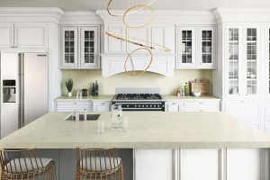
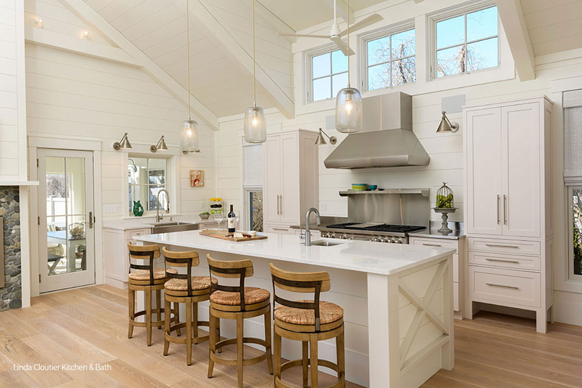
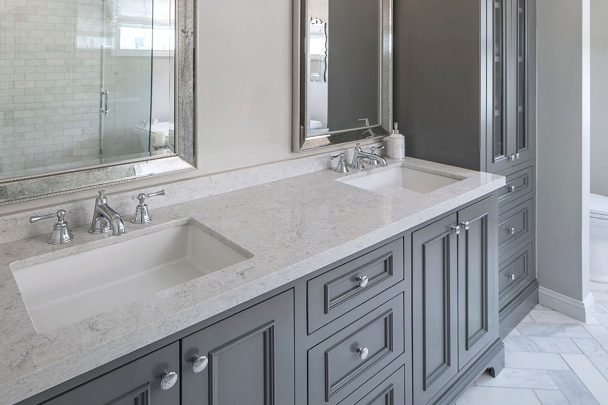
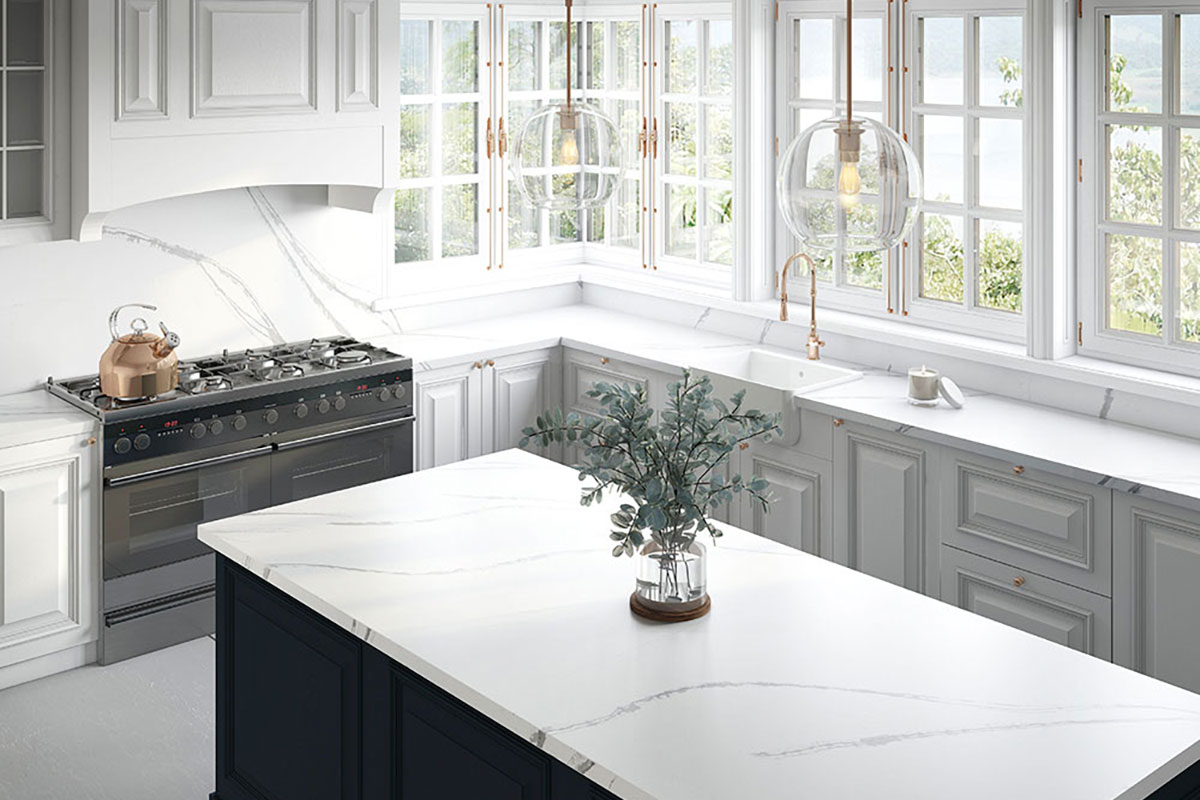
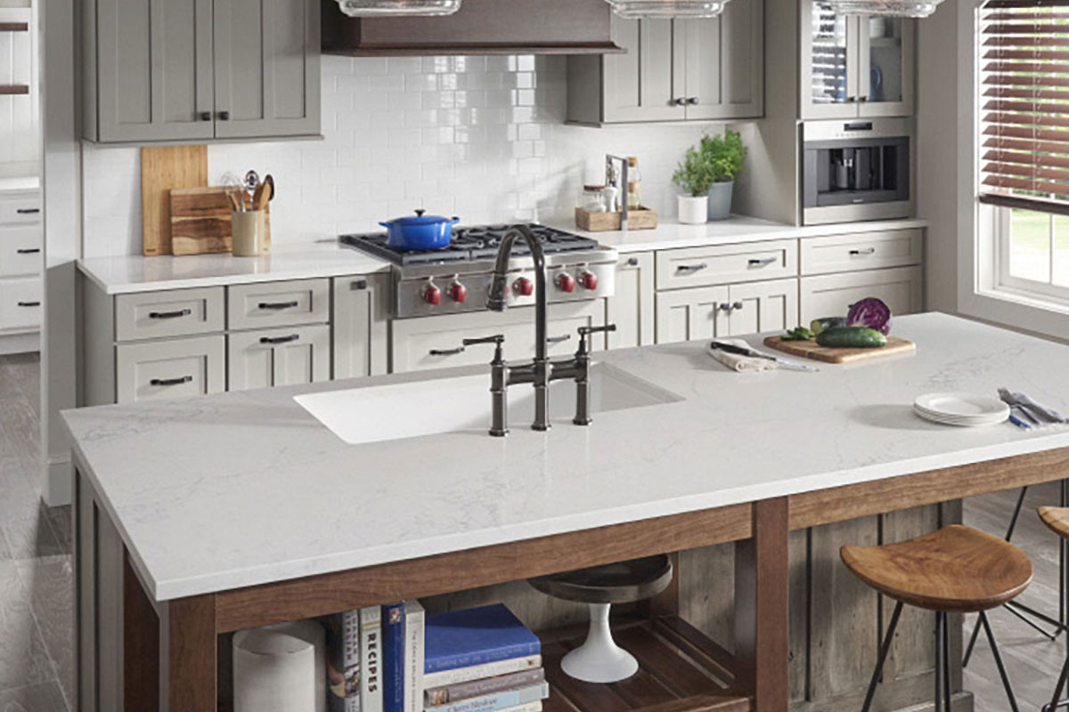
White kitchens and bathrooms once signaled cleanliness. But in 2025, stark white is giving way to warmer, more livable tones. Greige, cream, soft taupe, and light beige are taking over. These colors keep the space bright, but with a more relaxed presence.
Psychologists link light neutrals to calm and security. Unlike cool white, which can feel sterile, warmer tones create comfort without sacrificing clarity. They also offer versatility—greige can work with oak, walnut, or white-painted cabinetry. Cream walls support bold stone veining or natural wood textures.
Color Therapy Countertop pairing: Majestic White granite is ideal here. Its creamy base and subtle movement work with warm cabinetry and matte hardware. It looks timeless without feeling cold. See Majestic White at Rumford Stone
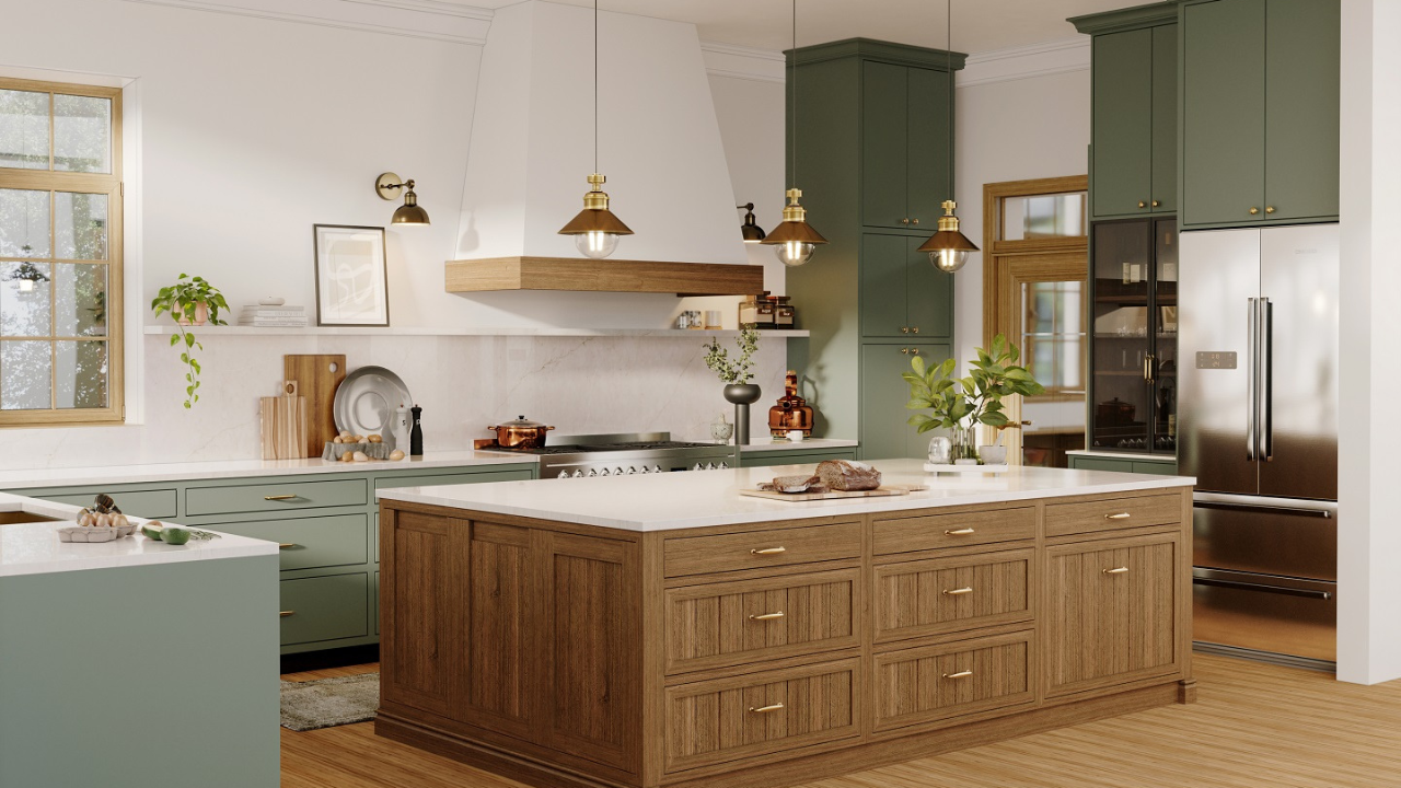
Nature’s Influence: Greens, Blues, and Earth-Toned Reds
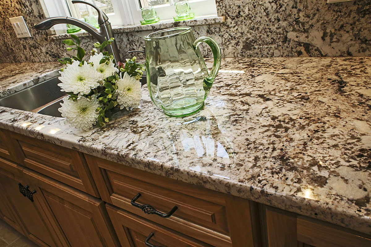
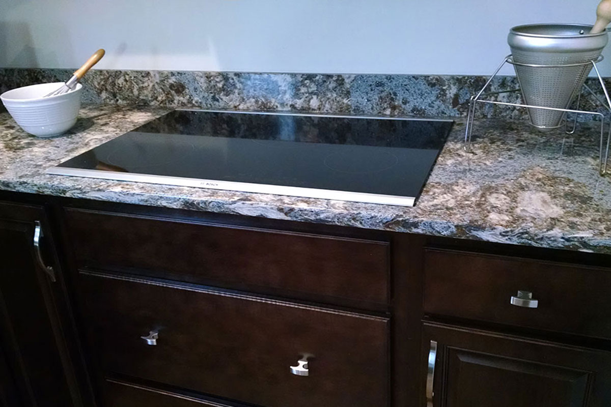
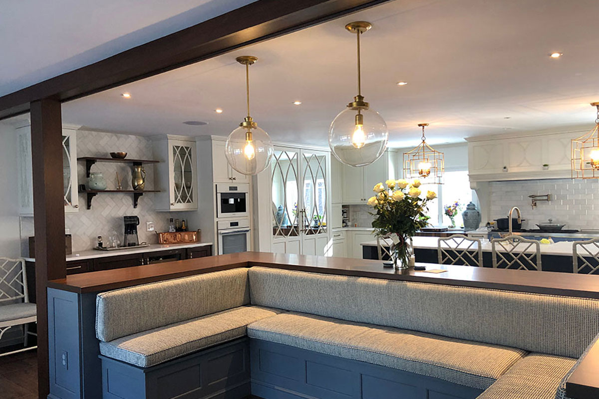
Designers continue to pull from nature’s palette. Soft green evokes balance. Slate and navy add focus. Clay reds, sienna, and leather-inspired neutrals bring richness without heaviness.
These tones don’t just look good—they align with how we process emotion. Blue and green are calming. They suggest safety and trust. Clay tones echo aged materials and bring depth, making them perfect for grounding spaces like kitchens and baths.
Countertop pairings:
- Blue Dunes granite offers sandy beige with blue-gray veining. It works well with navy islands, eucalyptus cabinetry, or soft green walls.
- Jet Mist granite provides moody contrast for rust-toned tile or brown leather pulls. Its charcoal base softens against warm fixtures. Browse Blue Dunes and Jet Mist
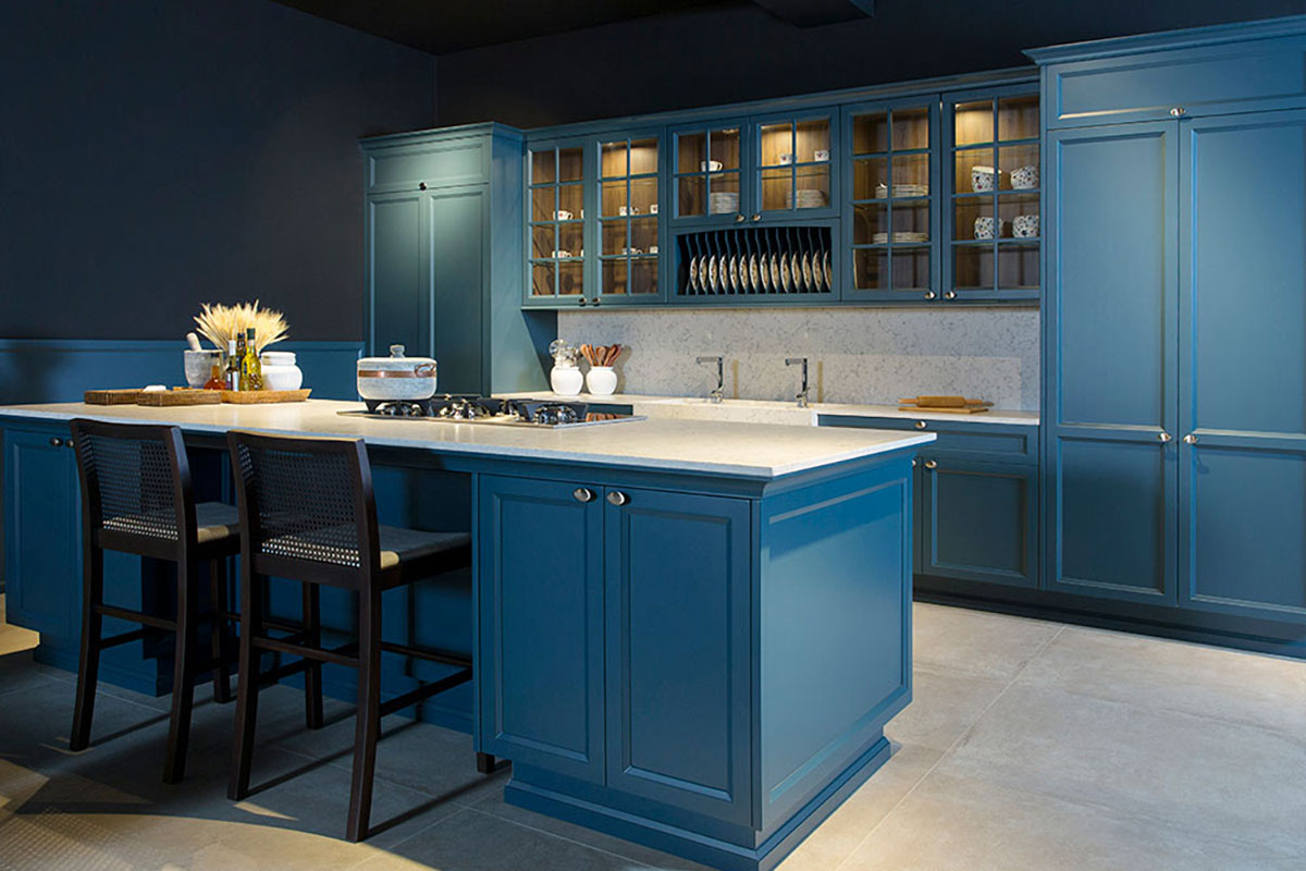
 Bold Moves: Where to Use Statement Color
When used sparingly, bold color can anchor an entire room. A slate blue fridge, a painted vanity in deep green, or a clay-colored faucet can shift the energy without overwhelming the design.
The best bold choices have room to breathe. A full-height backsplash. A wrapped shower wall. A powder-coated range hood. These all create focal points without clutter. The rest of the palette can stay quiet to let one piece speak.
Color Therapy countertop pairing: African Rainbow granite carries movement and energy, with natural gold and soft sienna tones. It complements deep blues and pairs beautifully with hardware in aged brass or matte black. See African Rainbow
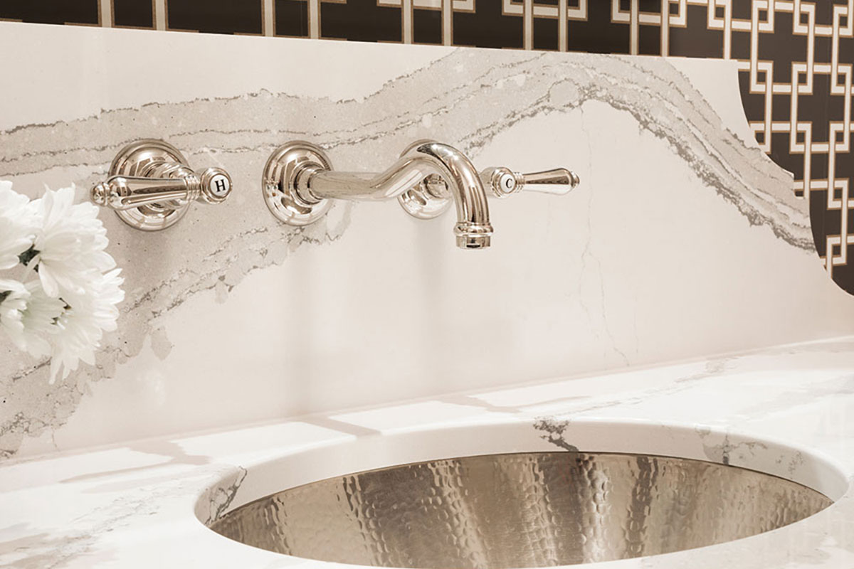
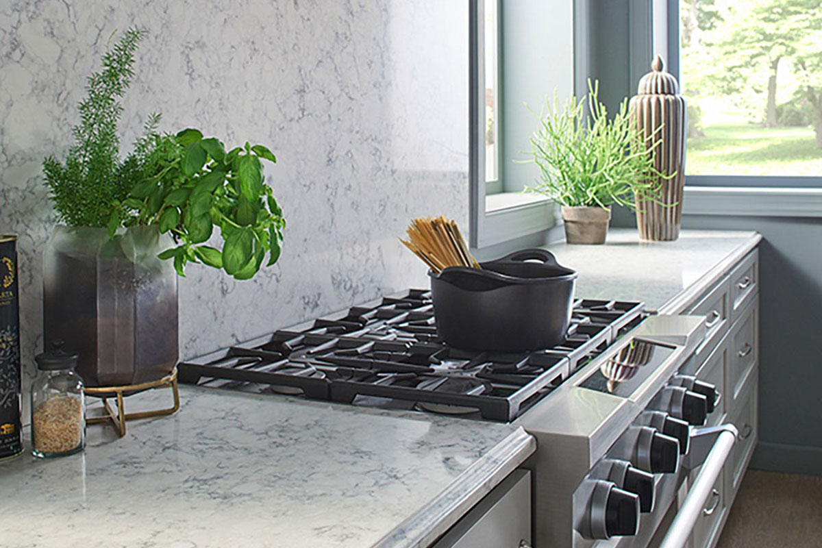
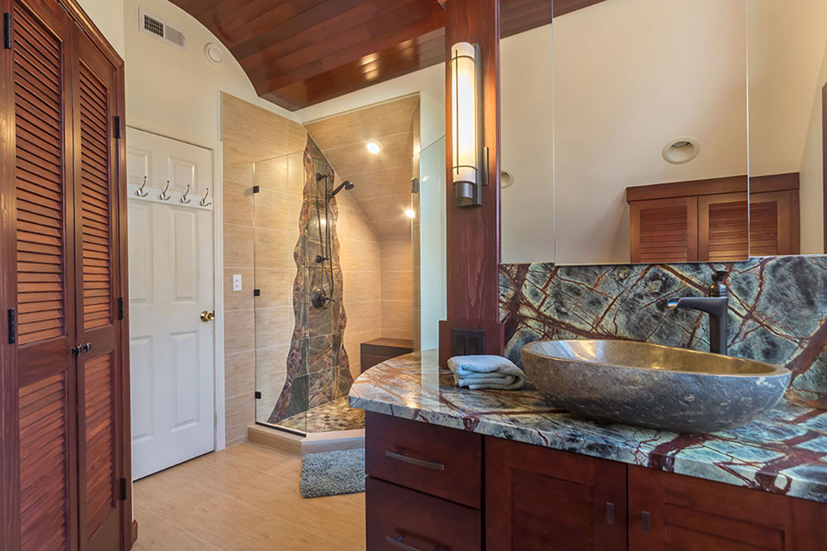
Color Therapy in Unexpected Places
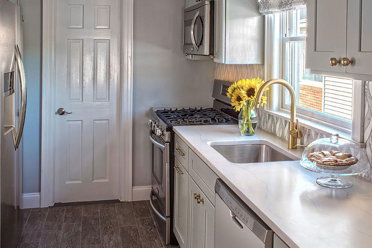
Color isn’t limited to walls or cabinets. Sinks in navy or matte white now hold visual weight. Ceilings painted in soft blush or cool gray shift proportion and soften light. Even fixtures and glass bring color—amber pendants or bronze sconces add mood and texture.
The temperature of light matters too. Warm lighting brings out cream and taupe. Cooler tones emphasize gray or green. These details impact the space even more than the paint color itself.
Countertop pairing: Viscount White granite, also known as Silver Cloud, provides soft gray movement with natural white contrast. It pairs well with blush paint, warm metals, and lighting that shifts tone throughout the day. Explore Viscount White
Tips for Getting It Right
- Start with how you want the room to feel. Calm? Energizing? Centered?
- Test samples in morning and evening light. Color can change dramatically.
- Use one bold choice per room and let it lead.
- Consider finish—matte paint feels softer than gloss. Honed stone softens bold color.
- Layer with light. Use natural, task, and ambient sources to shift mood.
Final Takeaway 
Color should support how you live. It should enhance how you use your space. Whether it’s the grounding presence of a green island or the lift of a cream-toned wall, the right hue transforms a room without altering its layout. Pair it with natural stone that echoes or balances your choice, and the result is a space that feels both intentional and lasting.
Every palette in this blog has a countertop to match. You can see the full color gallery at Rumford Stone or visit the slabyard to experience the tones in person.